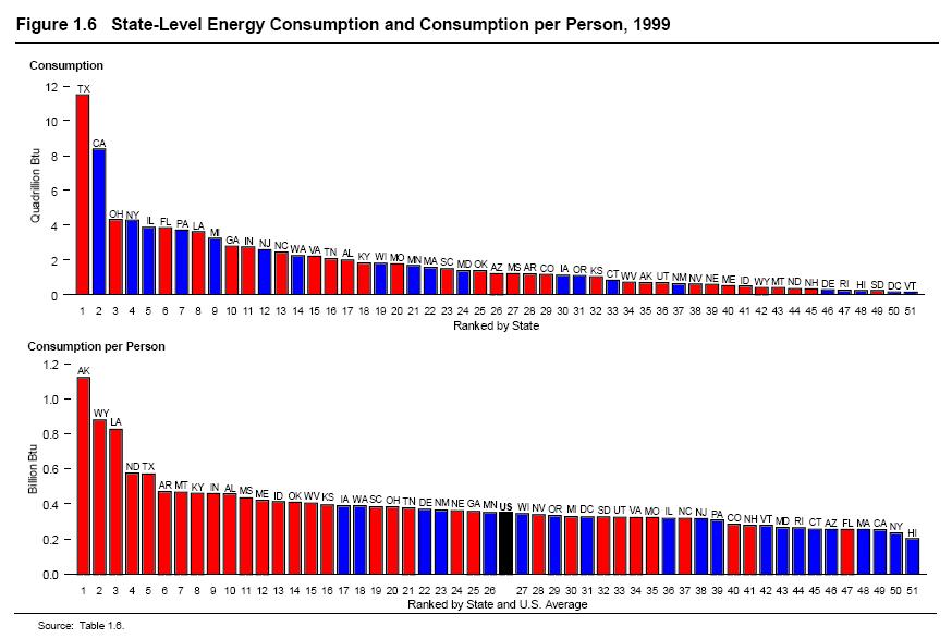
I realize you can't read anything in the image above, but if you click it it will come up full size, and should be readable. The first graph is the total energy per state. As you can see the red/blue (as defined by 2000 Election) is relatively well spread out. But the second graph is the energy use normalized to the population, basically how much energy is used by each individual person in those states (the black one is the US average). The first 16 states went to Bush. 16 states! These weren't the states that were close either, these were the blowout states of Texas and the midwest. Ya know, the ones they colored in about three weeks before the election. What does this tell us? Republicans use more power than Democrats? Not exactly, but it's interesting to see that the Republican dominated states are much less energy conscious. Now certainly places like Alaska have the fact that they are constantly heating their homes, which is a huge part of personal energy use. Other than that though, you have 15 states in the main body of the country that says, hey... the hell with you, i'm burning some oil in my front yard in a large barrel and you can't stop me, and I'm going to vote for child molesters.

1 comment:
Love it!
Yay for me getting to vote in Ohio! =)
Post a Comment